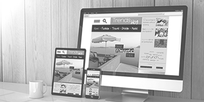
Design Tips for Content Websites
Crédito Foto: Por Viktor Hanacek en PicJumbo. Licencia
Having great design on a content website will play an important part in your user’s overall experience. Good design can increase trust, while poor design can decrease trust. Better designed websites will get more opt-ins, more sales and more referrals. In general, design plays a pretty big part in the overall web marketing picture. Here are a few design tips for content websites:
- Reduce Your Ads
Yes, you need to make money. However, crowding your page with advertisements really isn’t great design.
In fact, a study of several hundred thousand websites showed that statistically, having more ads on your site means you’re slightly less likely to rank well than other sites with fewer ads.
Your ads should integrate well with your website in general. The ads should be relevant, and placed strategically to get your user’s attention without being intrusive.
2. One or Two Images per Page
Having high quality, professional photos on your page can really add to the aesthetics of your site. However, crowding your page with graphics makes it look very unprofessional.
Try to have just one or two carefully chosen images per page. If your article is really long you can have one or two more, but try to avoid having images too close to one another.
Make sure any photos on your website are crisp, taken with a high quality camera. They also need to be relevant to the content. Try to have to color corrected before publishing, so the colors and contrast really stand out.
3. A Stellar Header Graphic
Your header graphic is one of the most important elements of what your website looks like. After all, it’ll be on the top of every page visitors go to, affecting their overall experience.
If you’re not a professional designer and you’re doing your website yourself, this is perhaps the one area where you should consider hiring someone professional to do it for you.
Your header graphic should contain just one or two graphical elements and just one or two text elements. The text elements and the graphic elements can’t both be too loud, or they’ll clash with one another or detract from the overall content.
4. A Coordinated Color Scheme
Your site overall will generally look better with relatively similar colors. Use complimentary colors or adjacent colors on the color wheel in your design colors.
Avoid colors schemes that clash or have one color standing out too much. The goal of your design shouldn’t be to bring attention to your design, but to create a positive framework for visitor to consume your content.
These are a few of the most important elements to designing content websites that look good and make people want to stay on your site longer.


