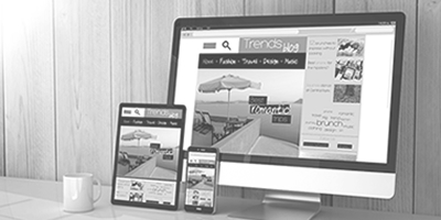
Mistakes To Avoid When Using Web Templates
Photo by @FreedomTumZ via Twenty20
Web templates are very affordable and they save you a lot of effort and time when you want to create a new layout for your website. However, a lot of people make mistakes in the process of choosing and using the web templates and end up with something that was unlike the image they had in mind. Here are some guidelines to help you avoid those mistakes.
The first obvious mistake you should be aware of is using the web templates that are very popular. If many people use the same template, your website will not appear unique at all and your credibility as a solid, different website will be tarnished. In other words, you will appear generic just like your next-door neighbors.
To the whole point of using the web, a template is to save time and effort. You just change the title and appropriate details and you’re done. The biggest mistake one makes is to customize the template beyond recognization. While that may be good in the sense that you’re creating a unique graphic, you’re defying the very purpose of using the web templates — saving time and effort.
However, on the opposite side, if a template you purchase is suitable but some changes must be made to suit your site’s theme, then you will have to take some time to make the changes. For example, you can find a very nice template that suits your hobby site except the original designer has put an image of stamps in the header. You can find images of garden plants and spades to replace the stamps for your gardening hobby site. However, do only make the necessary changes and don’t redesign the whole template.
Contact us: GRAPHICS XPRESS


